I want to give you a tour of what’s going on behind the scenes at Let’s WP. Using ClickUp for project management has become part of our everyday life, and we love it. It just takes collaboration to the next level, and you’ll learn how it achieves this. I’ll prove that it’s not just a glorified to-do list nor yet another Trello. Without it, we’d be lost in the swamp of team emails and way too long conference calls. Even if you are a lone wolf, ClickUp has a lot of value to offer. Its interface is so flexible that everyone can find the perfect layout.
ClickUp as a team communication tool
We primarily use Skype for weekly conference calls. However, I prefer that we communicate via our progress/status markers. It feels better to know when you are working that others are also doing their tasks, whatever those may be. I like the instant notifications and feedback and knowing what my team members are doing. I’m not saying this as assuming a boss figure but as an equal member of my team. ClickUp is hands down better than any email or chat, and as far as productivity goes, it even beats in-person meetings.
Features and interface elements we use
This section highlights the features we use and is not intended to give a full feature list. Therefore, that may be much longer.
View/layout
Every project and team is different, so what works well as a board and box-style (pinned notes), might not be so good when viewed as a list and vice-versa. Time or calendar view is only useful for tasks with deadlines or detailed date information added to them. For the lazy brainstormer who doesn’t want to spend all day on project management, the list view is perfect. Because it’s the most traditional layout, we never venture to others.
Structural elements: Teams, Spaces, Projects, Lists
- Think of Teams as your organization or your colleagues. If you are part of multiple teams or cooperate with different people, you’ll see that this is useful.
- Spaces are what we use for plugins or standalone websites. These are products what teams are working on.
- Projects belong to Spaces, they just group Lists.
- Lists contain the top level tasks.
Progress or status markers on Tasks
The first thing that got my attention regarding ClickUp is the customizable task status, which is a cardinal feature. You can decide that open/closed is what you need and the system won’t bother you anymore. However, we wanted to assign different phases to tasks, each with a different color. We use a soft Done that doesn’t disappear into the archive until we are ready to cross them off as Completed.
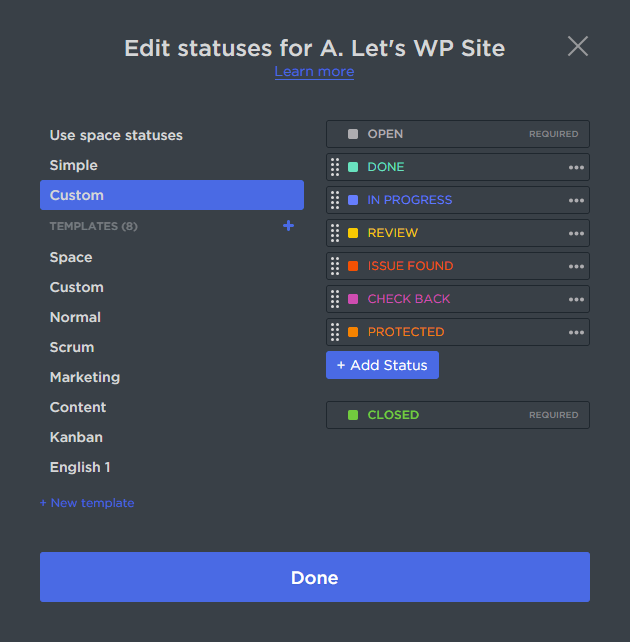
Usually, this is a Space-level feature, but you can also customize it for each Project. For example, if I want to deviate from my team’s standards, I can create more granular statuses for the Project that’s mine. Perhaps article writing needs different phases than development, who knows?
About tasks and subtasks
Now that we’ve established the mental image of a to-do list, here’s the trick. Tasks in lists can have subtasks – which in itself is not a unique feature, but hear me out. Tasks in ClickUp can have these project management extras:
- Rich text
- Comments
- Subtasks
- Checklists
- Multiple assignees
- Priorities
- Time estimates
- Logged time
- Dependencies
- Custom fields
The list goes on, as you can imagine. The subtasks can’t have more depth but the rest of the amenities ClickUp offers are the same. This well-thought-out structure helps limit the chaos. If you think this is already too much, don’t worry…
ClickApps
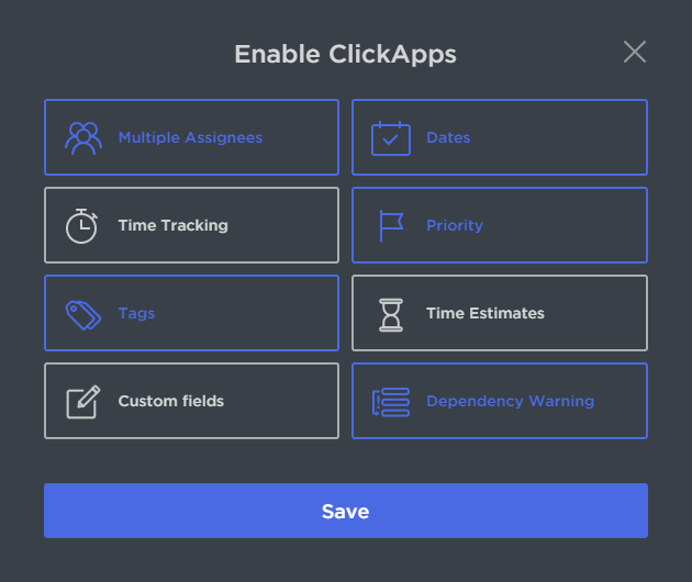
I love it when developers allow you to turn off core features. Not everyone needs whatever the devs come up with. So you can toggle the main features, and this will have a noticeable impact on the interface and any possible clutter. ClickApps are a space-level feature.
Task dependencies
Dependencies are useful especially during development when one task is waiting for another. We can easily set up a dependency relationship between two tasks, so everybody knows what needs to be completed first because others depend on it.
How do we structure our projects
A key strength of ClickUp is that it has no rigid structure for project management. You can use it however you like; nothing is mandatory, nothing is written in stone. If we decide to separate ideas, brainstorming and “big mental steps” like milestones to a different project we can. ClickUp replaces a long document with business plans. It’s much easier to browse colorful, brief task lists than boring docs. Some projects’ lists hold actual tasks we can progress with, while others are brainstorm-only.
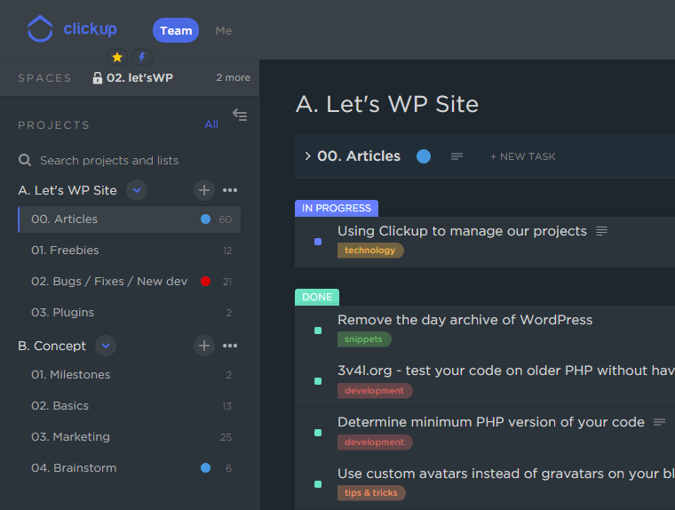
This screenshot is a concrete example of how we use the arsenal that ClickUp brings to project management. It’s for this very site. We can freely move, drag-and-drop, rename, expand/collapse just about anything.
The small things
Some elements may be small but are very important for us. Interestingly, these are often added just because of user feedback, as the kind developers listen to us and integrate these UX-enhancing bits and pieces.
Top-level goodies
- The dark skin. I was delighted when they introduced this. After the switch, I never looked back. I forgot what it looks like in white! 🙂
- Minimize tasks. I know Denes uses this feature a lot, and it makes the UI resemble an OS. Tasks are in popup windows, but keep what you use the most often on a floating taskbar, minimized – for easy switching.
- Switch from Team to Me, to see only my assignments.
- Pin the Spaces Bar to the sticky top menu, for those of us that have many Spaces.
- Search is brilliant. There is no search results page, but the live search is everything you could ask for.
- Filters that let you narrow down tasks by any criteria. It’s based on features in use by the space.
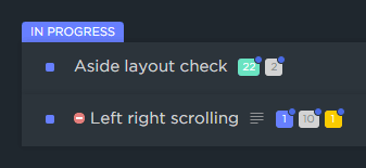
- See task content at a glance. There is a little icon on every task that indicates the amount of text content in it. What’s more, it shows the amount and status of subtasks, color-coded by progress.
Inside a Task
- Paste images into the rich text. Please note that this is not a standard feature of any text input or image upload zone. We always take cropped screenshots for various reasons, and it’s very convenient to add it to the text in the task, without any file saving, naming, and a formal upload procedure.
- See who’s watching. Actively and passively. Know who’ll receive notifications if you comment on or make changes to a task. However, it’s fun to see if other team members are looking at such task right now!
- Each task carries its own changelog to see who did what to it.
- Comments act as mini-tasks: they can be assigned, liked, and resolved.
- Mention people to invoke a notification for the targeted member.
- ClickUp detects links to other tasks in descriptions and enhances them to include task title and status. The linked task then receives the task mentions so you can go back and forth, lovely.

The story of Denes
Back when Mango Technologies launched ClickUp, we were still using Asana for project management. It wasn’t perfect, yet among the competitors, it gave us the most with favorable conditions. Then, BANG! ClickUp exploded into our lives. We waited a long time for someone to build this level of logical structure with a fresh and clear design. What Asana’s rigid structure didn’t allow us to create, they did it. Consequently, Mango proudly continued from there with the right “sky is the limit” attitude. Fortunately, it was easy to get to know ClickUp, even the task transfer from Asana went smoothly and quickly. From day one, it’s ready to import and delegate data from multiple competitors.
Since the beginning, ClickUp received regular updates, documented with tutorial videos on how to use the latest project management features. Each week we got some fun feature update or fixes. Regarding bugs, it was captivating how the Mango team responded real-time in chat. Some things couldn’t be fixed right away, but we continued communications via email, and later they got back to us. They said “We fixed it!” or “We added it!”. Yes, there were occasions when we recommended features for better UX, and they implemented them quickly. We experienced this incredible responsiveness from Chris and his team. MAX respect!
The stream of updates still stands, two years after the launch. As a small team, we don’t even use all depths of all possibilities, just those Firsh mentioned above.
Is the free ClickUp enough for effective project management?
There is a Free and an Unlimited ClickUp, but for some reason, we never hit anything that resembled a paywall. Using the Free version we need to watch the size of uploaded and used pictures, and some features are limited. In the unlikely case of reaching the imposed limits, we swear to upgrade! 🙂
About the ClickUp mobile Apps
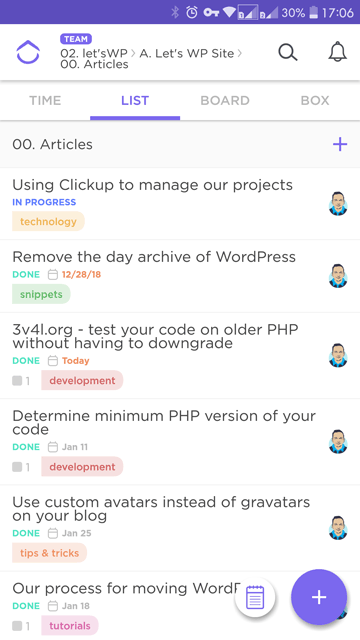
(Still Denes.) In the beginning, I used their iOS App, but the experience was incomplete, unlike the desktop. There were a lot of bugs, and it wasn’t so clean and comfortable to use as its big brother. When I switched phones – now proudly running Android – ClickUp was among the first Apps I installed. It manages to replicate 99% of the desktop experience, about which I’m still happy. The Android ClickUp App meets our project management expectations, and it’s fun to use, no matter where we happen to be. Thanks to that, I can now catch the essential updates of our projects whether I’m on a bus, flying on a plane, sitting on the toilet.. you name it. What more can I ask for? Not much, thank you. I’m satisfied with you, ClickUp!
Verdict: highly recommended
If it weren’t clear by now, we can’t function without ClickUp because it’s the best project management tool we used so far. ClickUp brings the team together and works as a wise system that has our backs. The more brainstorms, ideas, article pitches, progress notifications we make with it, the more convinced we are that this is a necessity for teamwork. Denes even uses it to manage life itself, now how cool is that?! Now, let’s try it:






Comments are closed.