
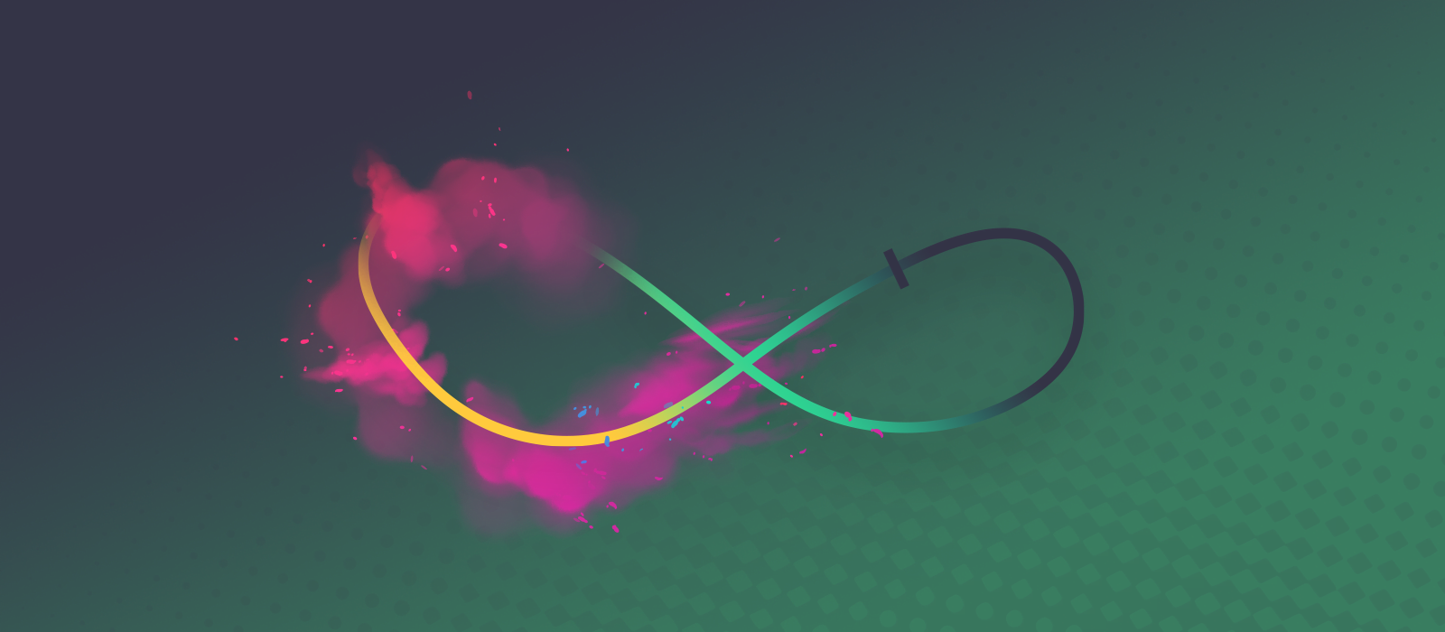
During my work on SVG Divider for Elementor, I learned how to breathe life into artworks. After evaluating some libraries, I decided to animate SVG lines by hand, using pure CSS. This practice reduces dependencies and the plugin’s footprint on customer sites. Meanwhile, the result adopts a polished look and offers stellar performance. In this article, I share what’s needed to animate something like this:
First, please familiarize yourself with the basics. While using the stroke-dasharray and stroke-dashoffset attributes to animate SVG is nothing new; I can offer some lesser-known or advanced tricks. These include manipulating the starting point or growing lines outward in multiple directions. Animating simple lines is easy; these are just open paths with an obvious beginning and end. In the examples below, I show this with a single straight line that is 100 units long. However, I mainly focus on animating closed paths with interesting shapes that have seemingly random starting points and drawing directions. Each demo path is ~100 units long, according to SVGGeometryElement.getTotalLength(). Let’s progress from simple to advanced movements.
Prerequisites
The most important thing is knowing the length of your path to animate. Obtain this information via JS or Illustrator. Given that I had hundreds of paths to work with, I went ahead and wrote an in-house script that notes the length of each line in every artwork. Important to realize that you’ll work with and hardcode these numbers (halving, doubling, adding values to them), therefore the path measurement doesn’t take place at runtime. My examples don’t include any JavaScript.
Ensure that the path geometry is error-free. In any case, the drawing direction and starting point of a loop are somewhat random (well, they need to start from somewhere). These factors depend on how the designer drew them, but I’m here to teach you to be unaffected by this problem.
Easiest SVG line animation
The first example draws the lines from their standard origin (red marker). At this time, the start remains stationary, and the animation concludes after 100 units. Thanks to stroke-dasharray: 100;, the line has 100 units of solid color, followed by 100 units of emptiness. It starts pulled back by 100 units using stroke-dashoffset: 100;. I’m reducing that to 0, so the animation can push the solid part of the line into view.
The blueprint looks simple enough:
@keyframes reveal {
    to {
        stroke-dashoffset: 0;
    }
}
svg path {
    stroke-dashoffset: FULL_LENGTH;
    stroke-dasharray: FULL_LENGTH;
    animation: reveal 1s ease-in-out 0s forwards;
}
Please note that:
FULL_LENGTHis the path length, to be replaced with an actual value. Use a unitless number.- Instead of the selector
svg path, target your object, such as line, rect, circle, polygon, etc. If multiple lines should animate together, adjust accordingly. If your paths are unnamed, you can use pseudo-classes likepath:nth-of-type(3). I made heavy use of them and learned from :nth Tester and nthmaster.com. - The
@keyframes revealshould be uniquely named, and appropriately prefixed. Without a doubt, single paths often need their own keyframes. - Try to avoid negative dash offset values, as you might see flashing or flickering on Safari.
- In the coming examples, I’m sharing the code in this blueprint format where you see the math behind the calculations. Of course, you can check out the actual demo code on JSFiddle.
Control the direction
Let’s say I want a clockwise animation direction on every path. If you look closely, the football and the heart go counter-clockwise (above). I omitted the unchanged ones, so you can see just those that I reversed:
The solution for reversal does multiple things at once.
- The line is invisible, with 0 dash units and 100 gap units.
- It turns visible with 100 units of dash, and 0 gap.
- Offset pulls it back 100 units, thereby reversing it.
The blueprint looks like this:
@keyframes reversed {
    from {
        stroke-dasharray: 0 FULL_LENGTH;
        stroke-dashoffset: 0;
    }
    to {
        stroke-dasharray: FULL_LENGTH 0;
        stroke-dashoffset: FULL_LENGTH;
    }
}
svg path {
    animation: reversed 1s ease-in-out 0s forwards;
}
To fully understand what’s going on, realize that the line’s dash-gap pattern is repeating. I’m affecting the straight reference line to show that the solid dash materializes at the end of the line. A copy of the same line also spawns at the beginning (before the red marker). It extends to the left, thus invisible. Here is an x-ray look, showing you what’s going on for 100 units before and after the line! I leverage this loop-around mechanism when I animate SVG elements with closed paths.
Yes, there are multiple solutions. The second example’s blueprint keeps the dash array stationary at full length and only animates dash offset from full length to double length. Use whichever you prefer!
@keyframes alternative-reversed {
    from {
        stroke-dashoffset: FULL_LENGTH;
    }
    to {
        stroke-dashoffset: DOUBLE_LENGTH;
    }
}
svg path {
    stroke-dasharray: FULL_LENGTH;
    animation: alternative-reversed 1s ease-in-out 0s forwards;
}
Animate SVG lines from a chosen start point
Next up, I move the start point of the animation without affecting the geometry. Since the line is like a train that loops around, it shouldn’t matter much where the track started. There are three different scenarios.
- Dark lines simply start from the other side of a closed path, or midpoint of an open path.
- Purple ones retain their previously-changed direction while starting from the opposite side.
- Blue SVGs have custom starting points to look better.
Start from the other side
Similarly to the last trick, the dash array values trade places, therefore drawing a line. Since the dash offset remains stationary, the original drawing direction remains intact. However, the animation starts from the opposite side by using a half-length offset (useful for symmetric paths).
@keyframes start-from-other-side {
    from {
        stroke-dasharray: 0 FULL_LENGTH;
        stroke-dashoffset: HALF_LENGTH;
    }
    to {
        stroke-dasharray: FULL_LENGTH 0;
        stroke-dashoffset: HALF_LENGTH;
    }
}
svg path {
    animation: start-from-other-side 1s ease-in-out 0s forwards
}
Reverse direction and start from the other side
Instead of shifting the dash offset by exactly a half-length, you could choose another value to start somewhere else. However, you need to add the full length to it, to reverse the direction.
@keyframes other-side-and-reverse {
    from {
        stroke-dasharray: 0 FULL_LENGTH;
        stroke-dashoffset: HALF_LENGTH;
    }
    to {
        stroke-dasharray: FULL_LENGTH 0;
        stroke-dashoffset: FULL_LENGTH + HALF_LENGTH;
    }
}
svg path {
    animation: other-side-and-reverse 1s ease-in-out 0s forwards;
}
Arbitrary start point
Based on the Twitch bit’s example, I pulled back the starting point by 17 pixels, but this can be anything. Use trial & error to find the best value.
@keyframes custom-start-point {
    from {
        stroke-dasharray: 0 FULL_LENGTH;
        stroke-dashoffset: 17;
    }
    to {
        stroke-dasharray: FULL_LENGTH 0;
        stroke-dashoffset: 17;
    }
}
svg path {
    animation: custom-start-point 1s ease-in-out 0s forwards;
}
Animate SVG paths inside out
This example moves the line outwards from the middle. To begin, it needs a half-length offset, which I increase to full length to pull back the line while it expands. Purple ones have different rules. The infinity could use a custom end position too, more on that later.
The blueprint should not come as a surprise:
@keyframes inside-out {
    from {
        stroke-dasharray: 0 FULL_LENGTH;
        stroke-dashoffset: HALF_LENGTH;
    }
    to {
        stroke-dasharray: FULL_LENGTH 0;
        stroke-dashoffset: FULL_LENGTH;
    }
}
svg path {
    animation: inside-out 1s ease-in-out 0s forwards;
}
Inside out from a custom position
Since Twitch bit and infinity are special snowflakes, I had to reposition their animation start point. The value (here 34) could be anything but add it the to half and full-lengths, respectively.
@keyframes custom-inside-out {
    from {
        stroke-dasharray: 0 FULL_LENGTH;
        stroke-dashoffset: HALF_LENGTH + 34;
    }
    to {
        stroke-dasharray: FULL_LENGTH 0;
        stroke-dashoffset: FULL_LENGTH + 34;
    }
}
svg path {
    animation: custom-inside-out 1s ease-in-out 0s forwards;
}
From ends to the middle
This approach is the opposite of inside out, only outside in if you will. On open paths (such as the straight line), this causes a “double line” effect as if two pens were drawing the SVG. It works by transforming a 0 dash, 100 gap line into a 50 dash, 0 gap version. We know that without gaps, the dashes join. Furthermore, I only allow the dash to reach half-length while reducing the gap twice as fast. I decided to revoke special treatment from the black sheep, as they will be improved in the next section anyway.
Finally, a blueprint without dash offset:
@keyframes outside-in {
    from {
        stroke-dasharray: 0 FULL_LENGTH;
    }
    to {
        stroke-dasharray: HALF_LENGTH 0;
    }
}
svg path {
    animation: outside-in 1s ease-in-out 0s forwards;
}
Control both start and end points
Having full control over how the animation draws the lines can be quite handy. By definition, controlling both start and end means that the animation features two moving line heads that travel to a common destination. Otherwise, part of the SVG would remain invisible. If the key points are close, one line segment will move slowly, while the other needs to go fast to cover more ground at the same time.
- Dark lines have a 1/4 vs. 3/4 split, but that’s not particularly useful on these shapes.
- Purple may benefit best from this total artistic control.
- Blue shows that decreasing the dash offset leads to a preloader-like result.
The blueprint shows the use of arbitrary start and end points. Don’t be afraid to go above the full length; it’s the only way to avoid negative values. When to offset is smaller than the from, you get what the circle is having.
@keyframes custom-start-end {
    from {
        stroke-dasharray: 0 FULL_LENGTH;
        stroke-dashoffset: ANY_START;
    }
    to {
        stroke-dasharray: FULL_LENGTH 0;
        stroke-dashoffset: ANY_END;
    }
}
svg path {
    animation: custom-start-end 1s ease-in-out 0s forwards;
}
Double lines extravaganza
The final example will unleash limitations and set your imagination free. Omitting #2 and/or #3 also yields interesting results. Breakdown:
- As a foundation, half-length dashes ensure the double lines.
- Shifting the animation by a quarter using a dash offset moves the starting point between the origin and the opposite end (or midpoint).
- Adding a quarter length difference in the offset (from-to) introduces movement to all line heads.
Blueprint for the dark ones:
@keyframes double-lines {
    from {
        stroke-dasharray: 0 HALF_LENGTH;
        stroke-dashoffset: QUARTER_LENGTH;
    }
    to {
        stroke-dasharray: HALF_LENGTH 0;
        stroke-dashoffset: HALF_LENGTH;
    }
}
svg path {
    animation: double-lines 1s ease-in-out 0s forwards;
}
Of course, the purple ones needed special attention. Infinity’s actual code:
@keyframes infinity-double-lines {
    from {
        stroke-dasharray: 0 53 0 47;
        stroke-dashoffset: 37;
    }
    to {
        stroke-dasharray: 53 0 47 0;
        stroke-dashoffset: 60;
    }
}
svg .infinity {
    animation: infinity-double-lines 8s ease-in-out 0s alternate infinite;
    stroke: #8D69D8;
}
It doesn’t make sense to devise a blueprint for unusual shapes, as each is unique. However, there is something to notice. The sum of the dash array values should be the full length. I used multiple dash-gap components, and they trade places, similarly to the earlier examples.
Conclusion
Summing up, it’s possible to animate SVG lines without any 3rd party library. All you need are these blueprints and some logical thinking. I’ve found that my results differ significantly from auto-generated animations. To put it differently, with some design sense, you can simulate a natural drawing flow. Of course, there are many more bits and pieces that make up a plugin that uses these animations. Some of the extras I used for SVG Divider for Elementor include:
- Controlling animation states via JavaScript.
- Lazy-starting via Intersection Observer.
- Using delays to combine multiple animations as if they were one.
- Custom easing functions.
- Using opacity in keyframes in addition to dash attributes.
- Animating dotted lines in an elastic or “ant march” fashion.
Let me know in the comments if you have any questions or want to learn more about a particular topic. Homework: inspect the JSFiddle examples and play with the values!


Comments are closed.