
I’m going to show you how to do the fancy underline animation you see on our links. This one is pure CSS and can span multiple lines! As with all pixel-perfect cross-browser effects (yay, more buzzwords!), it took a considerable amount of pain and suffering to perfect it. There are tons of underline animation tricks on CodePen, but I wanted you to understand how it works. An excellent way to do that is to create something we could call our own and show you how. A solution that is a little bit better than the canned effects.
The history of underline animation
Us internet users have come a long way since the era of the old school blue-purple links. Fun fact: Google still uses them. I think because it’s such an ingrained knowledge that “links are blue, visited ones are purple” that they aren’t brave enough to change it.
Initially, everybody used text-decoration: underline; , but it paints the underline to be the same a the text color. This standard method has two significant benefits. On the one hand, it produces perfect underline where the descenders of a letter leave gaps in the line. That’s hard to do with other solutions (white text-shadow works bad on normal font-size). On the other hand, the underline is close to the baseline. You’ll notice that in every alternate solution the link underline will go just below the descenders.
Early solutions
Back in the noughties, I remember finding a site with animated link hover color. It used JS, as this happened long before CSS3 transition was a thing. I freaked out in a good way, as it looked just like an effect from Macromedia Flash. Ironically, this showed me the first signs that the now-Adobe Flash was going to become obsolete.
Simple animated monochrome links weren’t enough. People wanted underline animation, affecting at least its color. Designers started to deviate from the old solution to achieve a different color for the underline. The need spawned links with a bottom border, such as border-bottom: 1px solid green;. This opened the way for animation.
Almost there
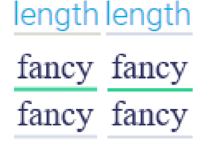
For a while, it seemed impossible to create the underline animation that moves horizontally. The problem with many approaches is that they use a pseudo element to position a second border or a rectangle under the letters. That doesn’t work multi-line at all. The left point (starting position) would be where the first word starts on the first line. It’d end where the last word ends on the bottom line. That solution creates a single underline that cannot span over multiple rows. If it’s hard to imagine, you can see the example below. I almost began boosting it with JS to make it work. I would have counted lines of links in left-aligned text and noted their coordinates with the Element.getClientRects() function. Thankfully, it didn’t have to go down that way.
Next step: horizontal link underline animation
The simple fade between border colors is cool, but we wanted more. This underline animation solution uses two linear gradient backgrounds behind the link. One background for the base color (grey), and another for the hover color (yellow). They aren’t gradients visually (but they could be). It’s just a way to generate an animatable multi-layer background with CSS. The hover color comes in from zero to full width, covering the base color. It’s simple in theory. However, browsers render it differently on a subpixel level. If I wanted to make it perfect, there had to be some fiddling. Let’s see the result first, so we can talk about it:
See the Demo by Firsh (@Firsh) on CodePen.0
Subpixel rendering problems
Every browser engine renders backgrounds differently. There is some anti-aliasing going on with the edges. On the letters, this is fine, while on the line it’s not. Even if I use a solid color GIF as a background, the edges of it will still be blurry. So, no, it’s not just the linear-gradient.
You can see that the two colors could overlap. A two-pixel line appears over 3 pixels. The blur is especially bad if the base color is similar to the background color. It decreases the contrast even more. I couldn’t just leave it at that. You’ll notice that the linear-gradient I use is weird:
background-image:
linear-gradient(
transparent 2px,
#2ed392 2px,
#2ed392 4px,
transparent 4px
),
linear-gradient(
transparent 2px,
#d8dce9 2px,
#d8dce9 4px,
transparent 4px
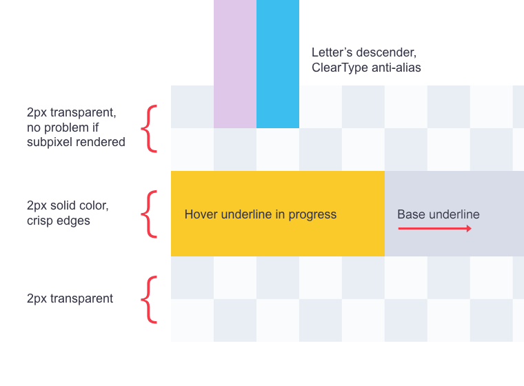
);It includes every color twice, has a transparent component, and starts at 2px. Wait, what? That’s intentional. It helps counter the anti-aliasing or subpixel rendering. Unless I do this, it’ll render every color of the rainbow except the exact color I want. The gradient image is 6px tall (not 4px), because the background-size property makes it so. The crisp colored line sits in the middle, unaffected by what’s going on at the transparent edges. Here is a breakdown of what’s going on.
This gradient background solution works well on high dpi mobile devices, in Webkit browsers and Firefox, but not in Edge. It does everything backward by blurring the middle 2px line but keeping the edges intact. It’s possible to target Edge with CSS @supports using the non-standard feature called -ms-ime-align. I define a simpler linear gradient for that browser, and that’s it.
Why use bottom padding and a transparent border?
First and foremost, I need to position the underline to my taste. By adding some padding, the height of the line increases to precisely move background while it sits at the automatic bottom position.
There is another problem, that is only present when a link breaks down to multiple lines. If you were to move the pointer across the text, the mouse cursor would change and flicker between lines. It depends on your line height, but as you can see we like the airy, large-text typography for optimal readability. In this case, it’s also necessary to buff the lines of links with a transparent border, so the mouse can better detect hot areas.
Caveats
While this is all fine and dandy, you might run into a few issues:
- This kind of underline animation is unconventional. Its styles aren’t going to be CSS reset by themes. A too broad selector will make any link on your site or in your content styled this way, including the call to action buttons and whatnot. Choose your selector carefully.
- The start and end of the line could still be subpixel rendered or anti-aliased, but not often. It’s not that bad. We used pseudoelements on our links to cover the first and last pixel of the underline, but this is probably too much attention to detail for y’all.
The result
Here is the CSS code, for all your viewing pleasures:
a.fancy, a.fancy:visited {
    text-decoration: none;
    background-image:
      linear-gradient(
          transparent 2px,
          #2ed392 2px,
          #2ed392 4px,
          transparent 4px
      ),
      linear-gradient(
          transparent 2px,
          #d8dce9 2px,
          #d8dce9 4px,
          transparent 4px
      );
    background-size: 0% 6px, 100% 6px;
    background-position: 0 bottom, 0 bottom;
    transition: background-size 0.3s ease-in-out;
    background-repeat: no-repeat;
    padding-bottom: 4px;
    border-bottom: 6px solid transparent;
}
a.fancy:hover {
    background-size: 100% 6px;
}
@supports (-ms-ime-align:auto) {
    a.fancy, a.fancy:visited {
        background-image:
            linear-gradient(#2ed392, #2ed392),
            linear-gradient(#d8dce9, #d8dce9);
        background-size: 0% 2px, 100% 2px;
        padding-bottom: 2px;
    }
    a.fancy:hover {
        background-size: 100% 2px;
    }
}
Why do underline animation at all?
You might have noticed that we like to pay attention to details. It’s our mindset, no matter what we do, frontend CSS/JS, design, or backend code. We strive to step forward with that one little extra thing that separates us from the rest. Our role model site is Stripe, and while not copying their design, we do share concepts and beliefs. Link underline animation is just one of those subtle extras that can make a site appear a bit more unique.


Comments are closed.