
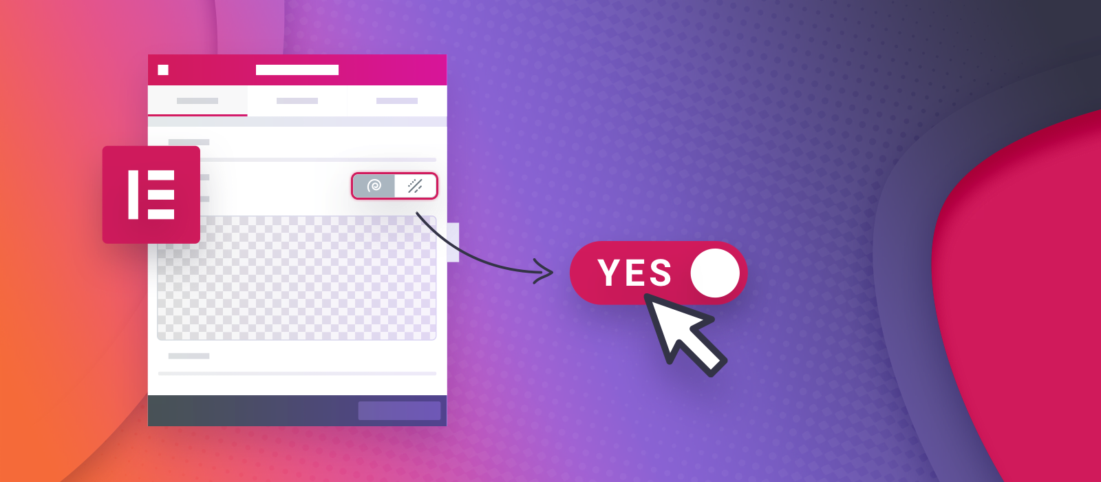
After reading the developer documentation on Elementor’s website, to my surprise, I found no mention of control conditions. Perhaps I missed it, maybe they’ll write about it someday. However, Elementor itself makes heavy use of this feature, allowing me to learn from their code. I found that in production, 80% of the settings in SVG Divider for Elementor are conditional controls. Here is one example:
Notice that a setting sits hidden until you change something else. For example, why would we show settings for animations when the style you chose doesn’t support them? Or why show an icon line width setting when there is no icon? It’s vital for an extension to not overwhelm users with every option at once. I’ll teach you what I know about creating these control conditions from the simple ones to compound rule sets. Please note that this article is for developers and requires PHP knowledge.
Where to add this option?
When you create a Widget, you register controls for it. Every example you read here goes into the Control Setting array of the add_control() method. Check out the Add Controls to Widgets page in the Elementor docs for the base knowledge on the matter!
Sections can also accept conditions in the start_controls_section() method, see more on this later.
The name of the parameter is condition for simple key-value pairs (yes, it’s an array). It’s the short form. There is another one called conditions, which is a more elaborate structure, see examples for that down below.
The simplest way with ‘condition’
My first example is the code behind what you saw in the video above. The custom control is only needed when another – called shape – is set to drawn. The key is a control name, and the value is an option name (or an array of option names).
$this->add_control(
    'svg_style_choice',
    [
        /* translators: Design means a drawn divider style or design. */
        'label' => __('Design', 'svg-divider-for-elementor'),
        'type' => 'sde_divider_select',
        'label_block' => true,
        'condition' => [
            'shape' => 'drawn'
        ],
        'default' => 'sa_01'
     ]
);
From now on, I’ll only quote the actual lines, like this:
'condition' => [ 'shape' => 'drawn' ]Instead of an equality check, you can negate too:
'condition' => [
    'animation_type!' => 'static',
    'shape' => 'drawn'
]
Notice the ! after the other control’s name. I also added another condition, so this control depends on both at the same time (and relation logic). You can see that this is not necessarily self-explanatory or intuitive, but easy to type out once you know what’s going on.
Check for “one of” using an array:
'condition' => [
    'background' => [ 'classic', 'gradient' ]
]
The advanced way, using ‘conditions’
Let’s move on to the advanced version, which allows a more precise setup. Notice the plural s in the conditions parameter, that uses the following:
relation |
One of and/or. If omitted, defaults to and. |
terms |
An array of arrays containing the rules. |
name |
The parent control’s name. |
operator |
Defaults to strict equality (===), when omitted. Otherwise, use one of:
|
value |
|
You could write this using the first approach, but I’m easing you into what’s coming. This checks if a user selected a classic shape and on top of that, wants to show an icon.
'conditions' => [
    'relation' => 'and',
    'terms' => [
        [
            'name' => 'shape',
            'operator' => '==',
            'value' => 'classic'
        ],
        [
            'name' => 'classic_middle_element',
            'operator' => '==',
            'value' => 'icon'
        ]
    ]
]
Now onto murkier waters. In the following, there are two groups. The members of each need to be present at once, but any group will do. The or relation only applies to the two term groups. Meanwhile, the group member terms have and relation by default.
What does this do? It checks if the user wants to show an icon as a standalone element or as part of a button.
'conditions' => [
    'relation' => 'or',
    'terms' => [
        [
            'terms' => [
                [
                    'name' => 'shape',
                    'operator' => '==',
                    'value' => 'classic'
                ],
                [
                    'name' => 'classic_middle_element',
                    'operator' => '==',
                    'value' => 'icon'
                ]
            ]
        ],
        [
            'terms' => [
                [
                    'name' => 'shape',
                    'operator' => '==',
                    'value' => 'classic'
                ],
                [
                    'name' => 'classic_middle_element',
                    'operator' => '==',
                    'value' => 'button'
                ],
                [
                    'name' => 'basic_button_inner_icon',
                    'operator' => '!==',
                    'value' => 'off'
                ]
            ]
        ]
    ]
]
Nested
Try to re-use terms by putting them in a variable. The first and second groups from the above example are now in variables called $standalone_icon_terms and $icon_in_the_button_terms, respectively. I wanted to reduce the chaos when introducing another level (nesting). This one is similar to the previous one. However, I’m also checking if the user chose the Let’s Go icon family (but also fulfilling the above control conditions).
'conditions' => [
    'relation' => 'and',
    'terms' => [
        [
            'name' => 'icon_family',
            'operator' => '==',
            'value' => 'letsgo'
        ],
        [
            'relation' => 'or',
            'terms' => [
                [
                    'terms' => $standalone_icon_terms
                ],
                [
                    'terms' => $icon_in_the_button_terms
                ]
            ]
        ]
    ]
]
Numeric types
I bet you haven’t seen this before. Elementor lets you apply operators like < to numeric values from controls such as sliders. The result is quite satisfactory if you want to target a numeric range and show another control (or even an extra description) when the conditions are met:
And the source for that is:
$this->add_control(
    'middle_element_spacing_note',
    [
        'type' => Controls_Manager::RAW_HTML,
        'raw' => '<div class="elementor-descriptor">' . esc_html__(
            'Lines will appear behind the middle element!',
            'svg-divider-for-elementor'
        ) . '</div>',
        'conditions' => [
            'terms' => [
                [
                    'name' => 'middle_element_spacing[size]',
                    'operator' => '<',
                    'value' => 0
                ]
            ]
        ]
    ]
);
Checking for empty values
Often, the value to check against is text. In these cases, a simple empty string ('') would suffice for an emptiness check. However, this doesn’t work for arrays (values from “multiple” Select2 Controls). Therefore, to check for an empty array using the short form, you’d use:
// Empty
'condition' => [ 'show_elements' => [] ],
// Non-empty
'condition' => [ 'show_elements!' => [] ],
In scenarios involving multiple control conditions, the usage is similar:
'conditions' => [
    'relation' => 'or',
    'terms' => [
        [
            'name' => 'some_select2',
            'operator' => '!==',
            'value' => []
        ],
        [
            'name' => 'some_text',
            'operator' => '!==',
            'value' => ''
        ]
    ]
]
About ‘in’ and ‘contains’
Use the in operator if you want to accept multiple values from the parent (!in to reject). Your value array is the haystack, and the other control’s single value is the needle. For example, this would allow a certain setting to appear for a group of icons or designs. Perhaps some of them support fill color, while others are purely line-based.
'conditions' => [
    'terms' => [
        [
            'name' => 'svg_style_choice',
            'operator' => 'in',
            'value' => [
                'sa_01',
                'sa_02'
            ]
        ]
    ]
]
The contains operator is so niche that even Elementor doesn’t seem to use it anywhere. Anyway, it’s the opposite of in. Your single value is the needle, and you are looking for it in the parent control’s haystack. Therefore, it only works for parent controls that return an array. The only useful use case I found is checking if your user chose a particular value in a multi-choice Select2 Control set up with 'multiple' => true.
'conditions' => [
    'terms' => [
        [
            'name' => 'show_elements',
            'operator' => 'contains',
            'value' => 'title'
        ]
    ]
]
What happens to the hidden?
The conditional logic is handled by both PHP and JS in Elementor. Subsequently, when a control is hidden from view, it’s not just a cosmetic thing. It has a null value when accessed via PHP.
Conditions for Control Sections
Now that you are familiar with how this works, here is a tip. There’s a way to avoid adding the same conditions to individual controls. Put all that belongs together under a Control Section. These have a dropdown and only one can be open at once. For example, the following is a Button Style section on the Style tab (duh), which depends on settings from the Content tab. The benefits:
- Each control in the section behaves as if it had the conditions.
- The value of every setting in a hidden section is null.
$this->start_controls_section(
    'basic_button_style_section',
    [
        'label' => esc_html__('Button Style', 'svg-divider-for-elementor'),
        'tab' => Controls_Manager::TAB_STYLE,
        'condition' => [
            'shape' => 'classic',
            'classic_middle_element' => 'button'
        ]
    ]
);
In action & source
If you wish to experience conditional controls live, check out SVG Divider for Elementor. We spent a considerable amount of time designing the flow of settings. Even if Elementor powers the majority of the back-end, there was still a lot to do. Reading their docs will still leave some questions on the table. Therefore, I recommend inspecting Elementor’s code, or ours. You’ll find lots of control conditions in sde-widget.php if you choose to learn from the latter.
Elementor’s relevant source files:
Happy coding!


Comments are closed.