
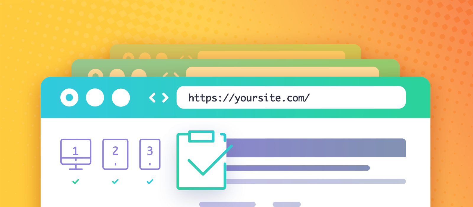
It’s not uncommon to test your creation before launch. But how exactly shall you proceed in today’s mobile-first world? With Internet Explorer far behind us, developers still face challenging waters. Even if modern browsers seemingly produce the same results, different devices, pixel densities & dpi scaling levels, orientations, processing powers, user preferences are always of interest. Whenever we launch a site or a new WordPress plugin, we subject it to scrutiny and even inspect pixels until it all seems right. Sometimes we need to leave our favorite device or browser and venture into new realms to test websites properly. We forgo our preferred power-user settings to experience how an everyday visitor would find our site. In this article, I provide a checklist of tips and won’t elaborate on any particular point in-depth.
Cache-busting on mobile
An essential thing in your toolset is knowing how to clear the cache of mobile browsers. Why? You’d think that private browsing or incognito mode works wonders to avoid browser caching problems when you test websites. They might open up a new can of worms, such as disabling access to localStorage, thus generating an error (Elementor also relies on such technology). When you don’t have the latest and most up-to-date devices, you’ll inevitably encounter pitfalls like this, even if they get fixed eventually. Your average visitor could be using older devices too!
Android Chrome & iOS Chrome
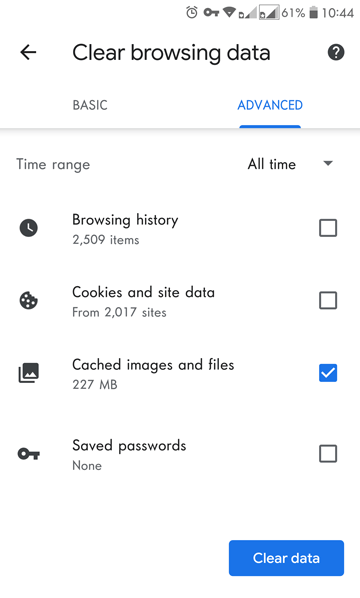
It’s available inside the app itself. 3-dot menu, tap History, then Clear browsing data… choose Cached images and files, then Clear data.
Firefox
In the browser on Android, tap the 3-dot-menu, find Settings, choose Clear private data, tick only the Cache, then Clear data.
For iOS, see Clear browsing history in Firefox for iOS.
Safari on iOS
Find Settings, but not in Safari. It’s the Settings app from the Home screen. Choose Safari on the left, then tap Clear History and Website Data (in blue).
Test websites in virtual machines
If you don’t have a Mac, you might want one, albeit virtually. I often rely on John’s articles from techsviewer to install macOS on VMware (on Windows). He periodically covers the latest macOS version. Therefore I’m not linking to any particular post. First and foremost, this setup allows me to test in desktop Safari.
Once on a Mac, install Xcode because it comes with a Simulator. Unless you have actual iDevices, it’s the best tool to test websites on them. You can choose the latest iPhones and iPads.
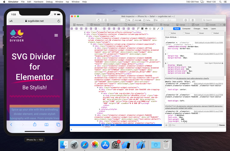
Please note the limitations of the Simulator of Apple Xcode.
- If you run an OSX device in virtual macOS or have an older Mac, testing will be very slow.
- You can’t install App Store apps (or browsers besides Safari).
USB debugging with Inspector
You must possess this capability to find site-breaking JS errors in the console or inspect visual glitches on mobile devices. The recipe sounds simple: connect your mobile device to your PC and inspect the browser tab in it. It even works in the virtual scenario depicted above (no cables involved). In practice, connecting things is not necessarily a walk in the park, but what is, when testing websites?! We have no idea why this is hidden like an easter egg!
When it works, it’s amazing. That’s a live video feed from the phone’s screen that you control with the mouse.
Chrome – Andriod – Windows
Get Started with Remote Debugging Android Devices
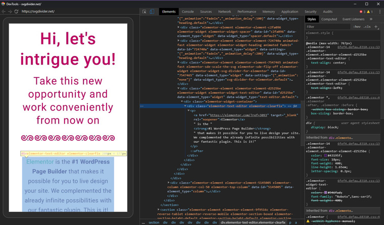
After you enabled USB debugging, you need to connect the device with your desktop computer. Then have Chrome open in both of them. On the mobile device, open your site. On the desktop, go to chrome://inspect/#devices and inspect a tab. If you are having problems, verify with the adb devices command that your phone or tablet is attached. See more about ADB at XDA.
Firefox – Android – Windows
Similar to Chrome, but also follow the about:debugging guide at MDN.
Safari – iOS – macOS
- In the Settings app, find Safari, scroll to Advanced, then turn on Web Inspector.
- On the desktop: from Safari menu, choose Preferences, go to the Advanced tab and tick Show Develop menu in menu bar.
- Open your site on the mobile device, in Safari. Then you can find your device in the desktop Safari’s Develop menu, and the domain of your site opened on it.
Network- or device-level ad blocking
Sometimes, our power-user choices set up walls for us to overcome. We assume you also have some ad blocker, that sits disabled in your browser for your site. But what about the AdGuard app that creates a local VPN to filter all traffic? Or what if you have Pi-hole, a network-wide ad blocker? Removing cookie notices and GDPR consent popups is part of the war against web annoyances. But WordPress plugins, such as Complianz (that we use) notoriously dislike when their scripts don’t load. Which, in turn, causes a JS error and breaks the site. So our advice is to test websites with and without various ad blockers, to ensure that essential functionality remains.
Windows settings that affect a site’s appearance
With the advent of user preference media queries such as the following, the web silently morphs to your liking in subtle ways.
@media (prefers-color-scheme: dark) { }
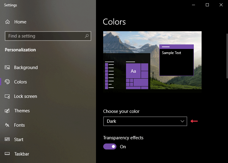
@media (prefers-reduced-motion: reduce) { }The darkness comes from a right-click on the desktop for Personalize then in Colors, choosing Dark.
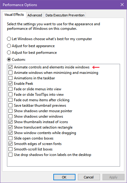
I got used to the absence of animations until I toggled my choice in Performance Options on my Windows 10. That’s at Win+R and sysdm.cpl, the Advanced tab’s Performance Settings.
These are almost the first things I change on a fresh Windows install. Adjusting system-wide dark mode or this animation preference in Windows has an instant effect (without reload) on fancy sites with these media queries. By the way, Elementor readily makes use of both! If you are wondering why animations are not playing on your site (for you), check this! Toggling these puts you in the shoes of your visitors, regardless of your personal preferences.
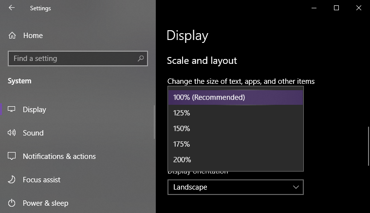
Pixel density and DPI scaling
This problem affects anybody who made the switch to a 4K display or a laptop of reasonable size with high resolution. Windows (by default) applies a system-wide DPI scaling to make text big enough to read. On a 13″ ultrabook, even just 1080p resolution requires scaling unless you have 20/20 vision. The scaling implies that your websites are zoomed in to a % that is similar to pixel ratio on mobile devices. The number may be 125% where the otherwise pixel-perfect elements will misalign. Keep this in mind when testing websites, and zoom in with the browser to emulate that behavior.


Comments are closed.