Yup, you read that right, this browser’s UI is just HTML and CSS. Therefore, you can customize Vivaldi however you like. First, you’ll learn how to enable the ability to inspect the browser itself as if it were a website. Then I’ll teach you how to make a compact bookmarks bar to fit more stuff there. Recently, a commenter asked about coloring tabs based on content, so I explored that and succeeded (so I can share it with you). Finally, we’ll see how to automate keeping the mod in place.
Inspect the browser UI
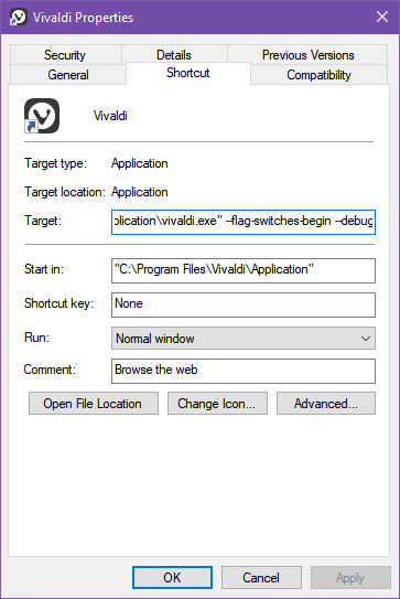
To enable this hidden feature, Vivaldi needs to start in a certain way:

--flag-switches-begin --debug-packed-apps --silent-debugger-extension-api --flag-switches-end- Find the icon with which you start the browser (on the taskbar?).
- Right-click on it, then right-click again on Vivaldi and choose Properties.
- Edit the target field to include the parameters after the path to the exe after the closing quotes and one space.
- Restart the browser. After this, the right-click menu on UI elements will include Inspect.
You’ll soon see that given this power, you gain the ability to remove anything you don’t like, and recolor elements based on your artistic self.
More compact bookmarks bar

Probably the most prominent pet peeve of mine is a relaxed bookmarks bar. I see so many friends using just a handful of icons there, with labels and everything, while it could comfortably house 90+ entries (if set up correctly). Admittedly, my regular bookmarks are just a cesspool of random things I found, and I hardly ever open them as a sidebar. I can fit everything I use at least once a week on that bar. It’s made possible by removing the names. Not necessarily hiding them, but moving them above the icon, so on the rare occasion I do want a name, a couple of letters still fit. Favicon-less sites or bookmark folders come to mind.
As a gourmet touch, I reduce the spacing between each icon. Find my code below. Later, you’ll see how to make it stick (survive restarts and even updates). For now, just paste it into the end of the Sources tab, style/common.css file for testing.
.bookmark-bar button {
    padding: 2px;
}
#main .bookmark-bar button span {
    margin-left: 2px;
    position: absolute;
    left: 3px;
    text-shadow: 0 0 2px black, 0 0 6px black, 0 0 10px black;
    font-weight: bold;
    top: 12px;
    font-size: 9px;
}
If you currently have names for each icon there, you will need to rename bookmarks to contain no text. Else things will look stupid. I find it useful to type a few letters (like UN for unread) onto the favicon to differentiate multiple bookmarks from the same site. For example, I like to go to Gmail in a show only undread way, but also keep a regular, show-all bookmark:
https://mail.google.com/mail/?shva=1#inbox
https://mail.google.com/mail/u/0/?shva=1#search/is%3Aunread+is%3Ainbox
The letters sit there as something like a badge, not in the dead center of the icon. If you customize Vivaldi like this, you’ll have all your favorites at your fingertips, neat!
Color Vivaldi tabs by content
See how cute this makes my tabs!

Next, something that I didn’t know I needed until I tried it. So, the trick is to target the favicon with a CSS attribute selector since it’s the only piece of the DOM that is representative of what site that tab holds. Notice that I placed the site’s name in the selector. More precisely, part of the path to each site’s favicon. The last two rulesets just make the colorization possible. Add this to the end of Sources tab, style/common.css, for now.
#browser .tab-strip .tab-position .tab img[srcset*="letswp"] {
    box-shadow: 250px -20px 50px 1vw #51D390;
}
#browser .tab-strip .tab-position .tab img[srcset*="fbcdn.net"] {
    box-shadow: 250px -20px 50px 1vw #3994F7;
}
#browser .tab-strip .tab-position .tab img[srcset*="reddit"] {
    box-shadow: 250px -20px 50px 1vw #FF4500;
}
#browser .tab-strip .tab-position .tab img[srcset*="wikipedia"] {
    box-shadow: 250px -20px 50px 1vw #808080;
}
.tab-position .tab.active .tab-header .favicon {
    overflow: visible;
}
.tab-strip .tab-position .tab.active .tab-header .favicon {
    filter: none;
}
Note that I use this with dark skin (I use Atom), and a right-side vertical tab bar. The mod colorizes the right side of your targeted tabs with a subtle gradient. It does not collide with current tab selection, nor should you mistake the colorful highlight for an active tab.
Where to save the custom CSS
Until now, you just used the developer tools to customize Vivaldi, but to make things stick, you need to save them. The location for our custom.css would be here (the file doesn’t exist, so create it):
C:\Program Files\Vivaldi\Application\[version]\resources\vivaldi\style\custom.cssNow you only need to reference it from this file:
C:\Program Files\Vivaldi\Application\[version]\resources\vivaldi\browser.htmlPut this line into the head of such HTML document:
<link rel="stylesheet" href="style/custom.css" />Restart the browser and voilà. The only downside? You lose all your customization when you update the browser. Trust me, you don’t want to re-mod manually every time. As usual, I got a solution!
Keep your mod with updates
A PowerShell bat file that you run after a Vivaldi update should be more pleasant than copy-pasting data. After all, these tasks can easily be automated. Save install-vivaldi-custom-css.bat
and custom.css files next to each other in a folder of your choice. Whenever you run the batch file, it’ll add the mods to Vivaldi. I loosely based the script on the installer of VivaldiHooks. Feel free to adapt it to your needs. It automatically figures out the version number but expects Vivaldi to be at the above path.
VivaldiHooks to customize Vivaldi with JavaScipt
I hope you like this trick to skin anything in the browser to your heart’s content without installing anything. Some modders even wrote custom JS for Vivaldi, called VivaldiHooks. That gave me the idea of messing with the bookmarks bar in the first place, as I used to use that pack and learned a few tricks from it. They added various little enhancements that you might like. Some of those make the UI even more compact, while others improve everyday usage.


Comments are closed.