

After closing a relatively long development and support break, first I shipped this version with a solution for a tiny, but annoying issue. It’s the “cut-off” effect of tooltips on mobile devices.
What was the problem exactly?
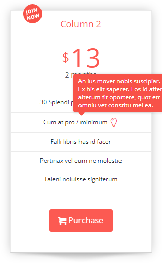
It lies in the positioning of the tooltip. When having wider content, the tooltip is shifted out of columns, or often tables.
This problem happens in every case when the table fills up the entire horizontal area, and there isn’t enough space on the sides of the pricing table. Typically, devices with narrow viewports (like mobiles and tablets) were affected.
Until this version, the only option you had was playing the width of the tooltip. With more or less success, because of the flexible width of columns.
The solution
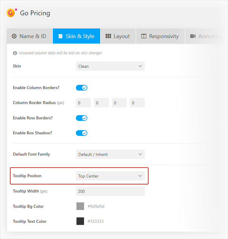
In this version, I reworked tooltip positioning by giving it more flexibility. First of all, you can choose a position option under the Skin & Style tab. Besides the default “Top Right” position, you can choose from “Top Center” and “Top Left” positions. Whichever you select for desktop, the “Top Center” will automatically apply to mobile and desktop viewports. It ensures that tooltip won’t shift out of the column. Furthermore, the tooltip cannot be wider than its column.
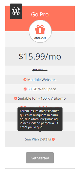
The result looks like this:
I’m continually working on the next smaller and major updates. That means keeping the focus on resolving the most annoying bits and adding the most wanted features. That’s all for now! Happy updating!


